 Brand IdentityConcept project
Gabriel Tattoo: Studio Brand Identity
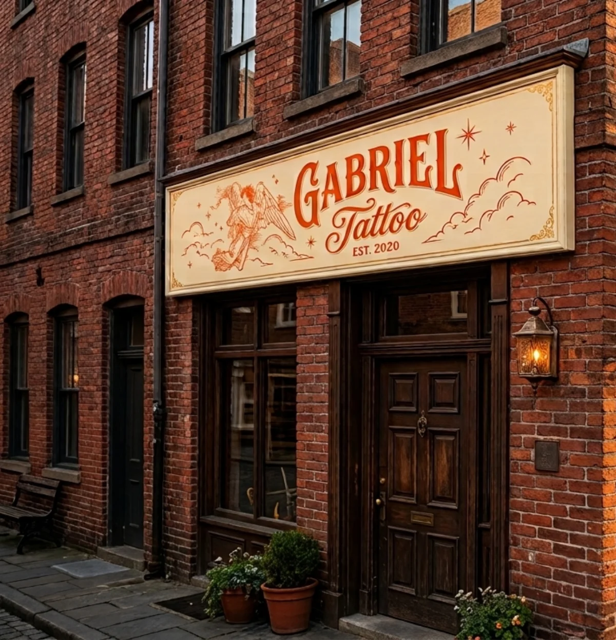
A hand-etched brand identity for a fine-line tattoo studio, carried from the logo to the storefront sign.
A self-initiated concept piece, not commissioned client work. It's here so you can see how I work.
- Client
- Gabriel Tattoo
- Timeline
- 4 weeks
- Year
- 2026
- Services
- Brand Identity, Logo Design, Signage
Overview
Scope
- Logo & wordmark
- Storefront signage
- Business & aftercare cards
- Brand guidelines
- Social templates
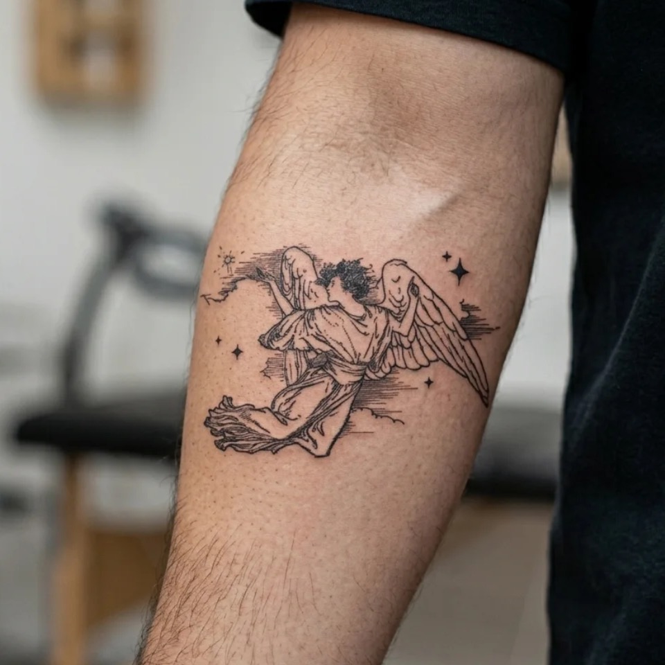
Gabriel Tattoo is a fine-line studio known for delicate, engraving-style religious and celestial pieces. The work was the draw, but the branding, a stock gothic font over a borrowed skull icon, looked like every other street shop and undersold the artistry waiting upstairs. We built an identity as considered as the tattoos themselves.
The challenge
Gabriel's own linework is precise and painterly, but nothing on the street signaled it. The old sign used a generic gothic font and clip-art skull that could belong to any shop on the block, so foot traffic kept walking past without a reason to stop.
How I approached it
Mark & wordmark
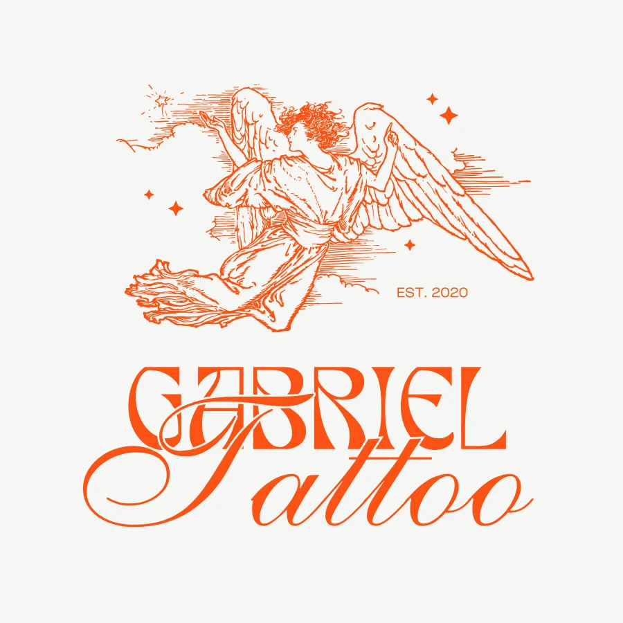
We studied the studio's own flash and turned its signature guardian-angel motif into a hand-etched emblem, paired with a custom vintage script wordmark.
Signage & storefront
We designed and specced two hand-painted signs sized for the corner frontage, so the new mark reads clearly from either direction on the street.
Collateral
Business cards, aftercare cards, and Instagram templates all extended the same engraved line-work system as the sign.
Guidelines & handoff
We shipped a short brand guide covering type, line weight, and motif usage, so every artist's flash and every post stays on-brand.
Have a similar project?
Tell me where you want to go and I'll map the fastest route there.